Variant
Choose how the widget is presented on your page - a compact overlay for minimal footprint or a sliding drawer for a richer, side panel experience| Property | Type | Default | Notes |
|---|---|---|---|
| variant | ”compact” | “drawer" | "compact” | |
| subvariant | ”router” | “earn" | "router” |
Check out the GlueX Studio to play
around with variants
Compact (Default)
The compact variant is ideal for scenarios where screen real estate is limited, such as smaller screens or integrated sections of your web application. It provides all essential functionalities in a condensed view, allowing easy embedding anywhere on your page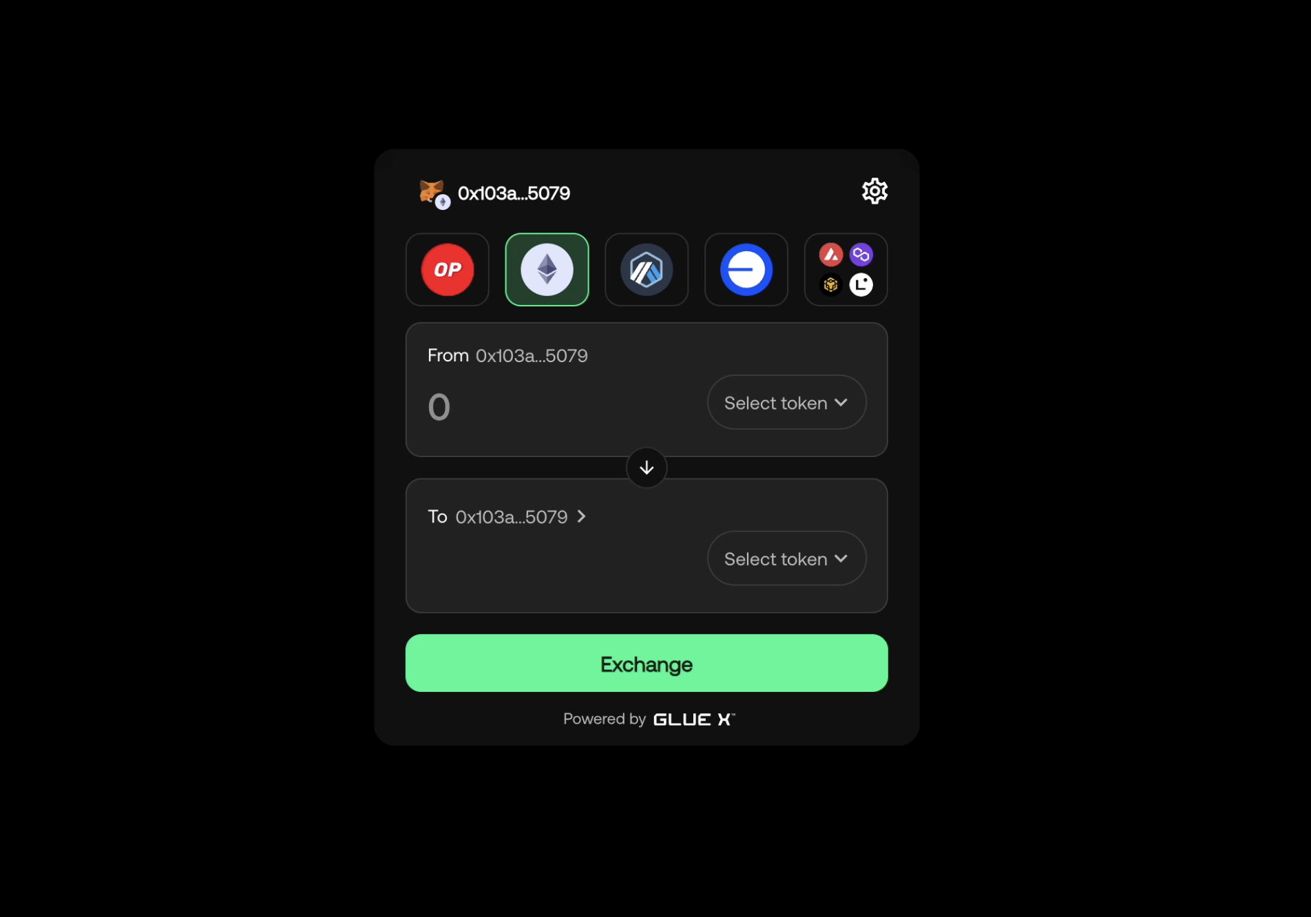
Drawer
The drawer variant presents the widget as a sliding side panel, offering a richer user experience. It can be dynamically shown or hidden based on user interaction and maintains the same layout as the compact variant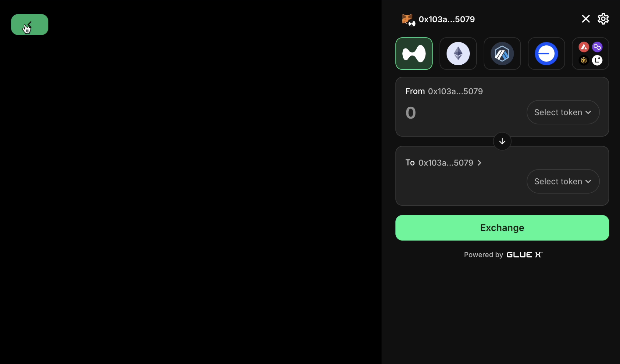
ref to the widget
Here is an example of controlling the drawer with ref: